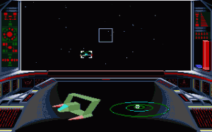
Welcome to the first of a series of “Best of/Worst of” articles looking at various facets of space gaming. These opinion pieces are based on my experience and memory, and are therefore totally open to discussion and debate. I’d like to start this series of articles by looking at an insanely important part of any good space sim, the Heads Up Display, or H.U.D. Please keep in mind this not only includes the H.U.D. but the overall cockpit view as well, and these are rated on usability and overall enjoyment. With that in mind, let’s begin with the worst of the bunch…
Playing space games as long as I have…one plays a lot of crap, and boy I have played a lot of crappy space sims in my time (and will continue to do so when they’re released). I’ve gone back into my memory, done a bit of research and have come up with what I think are some of the worst Heads Up Displays in space gaming. These include:
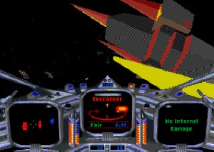
Star Crusader was actually a damned fine game. It had a great story that hadn’t really had an equal at the time, with a truly huge and branching campaign that could go in many different directions, and a fantastic story, as well as unique spaceships and so on. It’s just a damned shame its usability in the cockpit was such crap.
As a space sim, one would expect that a good H.U.D. would be able to handle three dimensions, but oh no, not Star Crusader. You were presented with a center targeting computer could barely differentiate between whether a target was in front of or behind you, a radar view that was close to useless, and a third screen that just displayed stuff like damage, which didn’t help much a lot of the time. While the combat was fun once you got used to it, the cockpit view was never anything less than a pain in the ass.
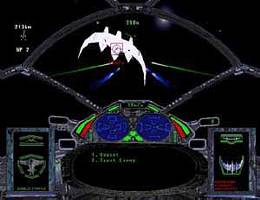
Next we come to Forced Alliance: The Glarious Mandate, which was a bad game in its own right despite some neat ideas like rising in rank and commanding more ships as you do so. Sadly, none of its ideas were never implemented very well, so what we received was a mediocre space sim that was lost amongst a sea of competitors at the time (and damned how I miss that sea). That wasn’t the worst of it though.
The overall H.U.D. in Forced Alliance is just awful. I don’t know what it is about the colors or the brightness, but it was always hard to look at, and actually caused me headaches from time to time. That’s NOTHING compared to the damned ridiculous split radar view — one for forward and one for behind RIGHT next to each other, which made it confusing for some reason — that was as annoying as it was useless. It also had a huge black area in the middle for messages and stuff, which is a TOTAL waste of space, in my opinion. I didn’t play this game for long back in the day, and the overall H.U.D. was partly to blame.
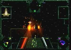
Our winner (loser?), though, for worst H.U.D. has to go to Darklight Conflict. It’s no secret that this is one of my least favorite space sims ever. Part of that was the damned confusingly useless H.U.D. The middle was a horribly inept radar screen that was just a mess of dots, followed by various indicators and displays that were just too damned big and took up too much screen real-estate at the time to be very useful.
I maybe played four or five of the missions in this game back in the day before giving up in frustration and annoyance. It’s not that the game was too hard — it didn’t feel that way at the time — it’s that I had little to no situational awareness. Overall, while the game was pretty, I wished the developers had put more time into the more static elements of the screen, like the ones in our cockpit. If you know of a worse H.U.D. than this, let me know.
Since this article got a bit long, I’ve split it into two, and tomorrow we’ll conclude with the best Heads Up Displays in the business. Thanks for reading, and I’ll see you tomorrow.
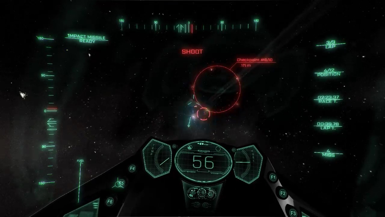

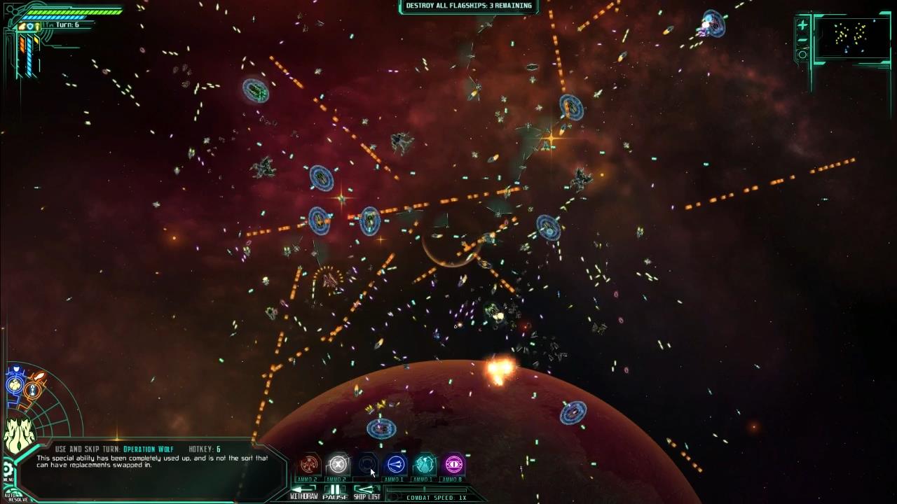
Brian, is there a way to embiggen? Or maybe make the default thumbs not so thumb-sized?
Also, I remember Darklight Conflict. I really really wanted to play it, since it seemed to have some cool ideas (none of which I can remember now). Ultimately gave up for the same reason, hah.
Sadly those old games were really small in their native resolutions, so those are about the biggest I could get. And yay, so glad I'm not alone! :)
Do you remember if it was possible to permanently lock a target in Star Crusader? Every time I try to get into that game, I run into the target screen that jumps endlessly from one ship to another, making it impossible to stay on top of crowded dogfights. That and all the ship collisions. If the tracker stayed on one target at a time, it wouldn't be nearly as bad.
Darklight's situational awareness is lousy. However, since your ship can take nearly unlimited punishment, you can often sit in place and use the incoming fire to reorient. Harder to do on defense missions or during attacks on cap ships with one-hit-kill weapons.